Stop Wasting Time on Fluffy Graphics: Try These 7 Data-Driven Hacks for Your Pitch Deck for Investors
- CapMaven Advisors
- Mar 23
- 6 min read
Let’s be honest: your investor pitch deck isn't a high school art project.
We’ve seen too many founders spend weeks obsessing over the exact shade of "B2B Blue" or finding the perfect stock photo of people high-fiving in a glass-walled office. Meanwhile, their investor grade financial model is tucked away in a messy spreadsheet that no one wants to open.
Here’s the cold, hard truth: Investors are spending less time than ever looking at your deck. In 2024 and 2025, the average review time dropped to under four minutes. If you’re spending your time on "fluffy" graphics instead of high-impact data, you’re losing the room before you even get in it.
At CapMaven Advisors, we’ve helped founders maintain a 70% first-meeting conversion rate. We don’t do it by making things "pretty." We do it by making them undeniable.
If you want to move the needle for VCs, you need to stop designing and start documenting. Here are 7 data-driven hacks to transform your pitch deck for investors from a slide show into a deal-closer.
1. Lead with the "Meat," Not the Logo
Most founders start their deck with a title slide, a "vision" slide, and then a slow build-up to the problem. By the time they get to their actual traction, the investor has already started checking their emails.
The Hack: Lead with your key metrics. If you have $1M ARR, 20% MoM growth, or a pilot with a Fortune 500 company, put that on Slide 2.
Investor attention is at its absolute peak in the first 30 seconds. Use that time to prove you have a business, not just an idea. Instead of a giant logo, use that space for a "Snapshot" slide:
Current Revenue/GMV
User Growth (Last 6 months)
Key Partnership Secured
When you lead with data, you set a tone of competence. You aren't asking for permission to exist; you're inviting them to a moving train.

Visual: A sleek, minimalist 3D bar chart showing an aggressive upward trend, rendered in a translucent glass aesthetic with neon accents.
2. The "Rule of 14": Kill Your Darlings
The data is clear: the optimal length for a pitch deck has shrunk. In 2019, 19 slides was the norm. Today, it’s 12 to 14. Y Combinator data suggests a massive 72% drop in investor interest for decks that exceed 20 slides.
The Hack: Every slide must earn its keep. If a slide doesn't directly support your startup fundraising strategy or prove your valuation, delete it.
Practical Tip: The "So What?" Test Look at every slide in your current deck. Ask yourself, "So what?"
Slide: "Our team has 50 years of combined experience." -> So what? -> "We have the specific technical depth to solve this $10B problem faster than any incumbent." If you can't answer "So what?" with a data-backed reason why you’ll win, the slide is fluff.
3. The 30% Data Threshold
Decks that dedicate at least 30% of their slides to pure data elements (charts, tables, cohort analysis) see 3x longer engagement from investors. Why? Because data is the "currency of trust."
The Hack: Don't just tell them you have "high retention." Show them a cohort table. Don't tell them the market is "huge." Show them a bottom-up market research analysis that breaks down your Serviceable Obtainable Market (SOM).
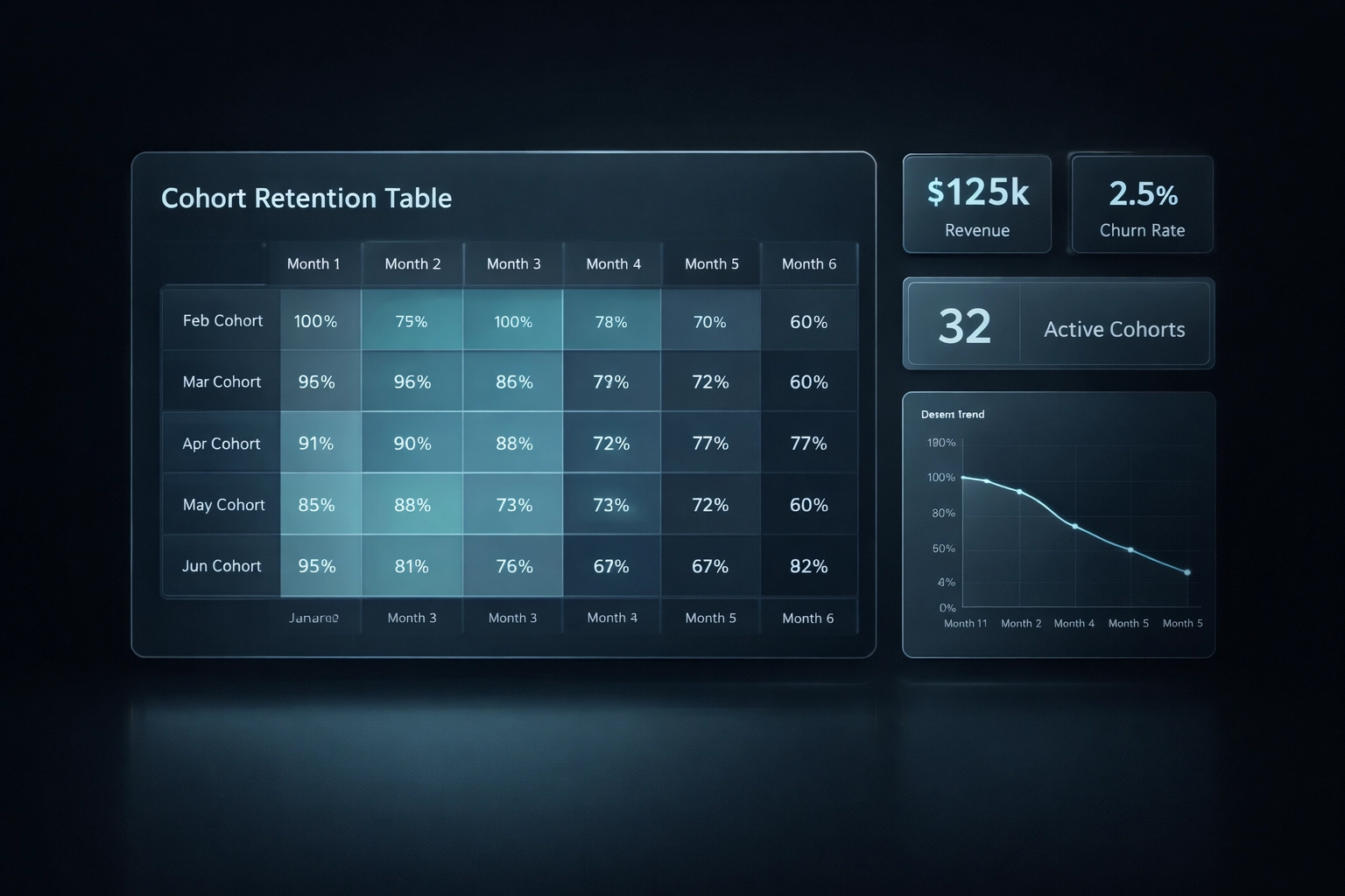
At CapMaven, we advocate for "Data-Driven Storytelling." This means your data isn't a separate section: it's the backbone of your narrative. When you talk about the "Problem," use data to show the cost of that problem in dollars or hours lost.
4. Replace Generic Charts with "Narrative Visuals"
A simple line chart showing "Users over Time" is fine, but it doesn't tell a story. It just shows a trend. Investors want to see the mechanics of your growth.
The Hack: Use specific visualizations that address VC concerns:
The CAC/LTV Funnel: Don't just list the numbers. Show the funnel. Show how $1 into the top of your marketing engine turns into $5 of lifetime value at the bottom.
The 2x2 Competitive Moat: Instead of the standard "check-box" table where you magically have every feature and your competitors have none, use a 2x2 grid that focuses on strategic advantages like "Data Propriety" vs. "Ease of Integration."
Real-World Example: Instead of a slide saying "We are growing fast," try a CMGR (Compound Monthly Growth Rate) chart overlaid with "Key Milestones." This shows the investor exactly which product launch or partnership triggered the growth spurt. It proves you understand your own levers.
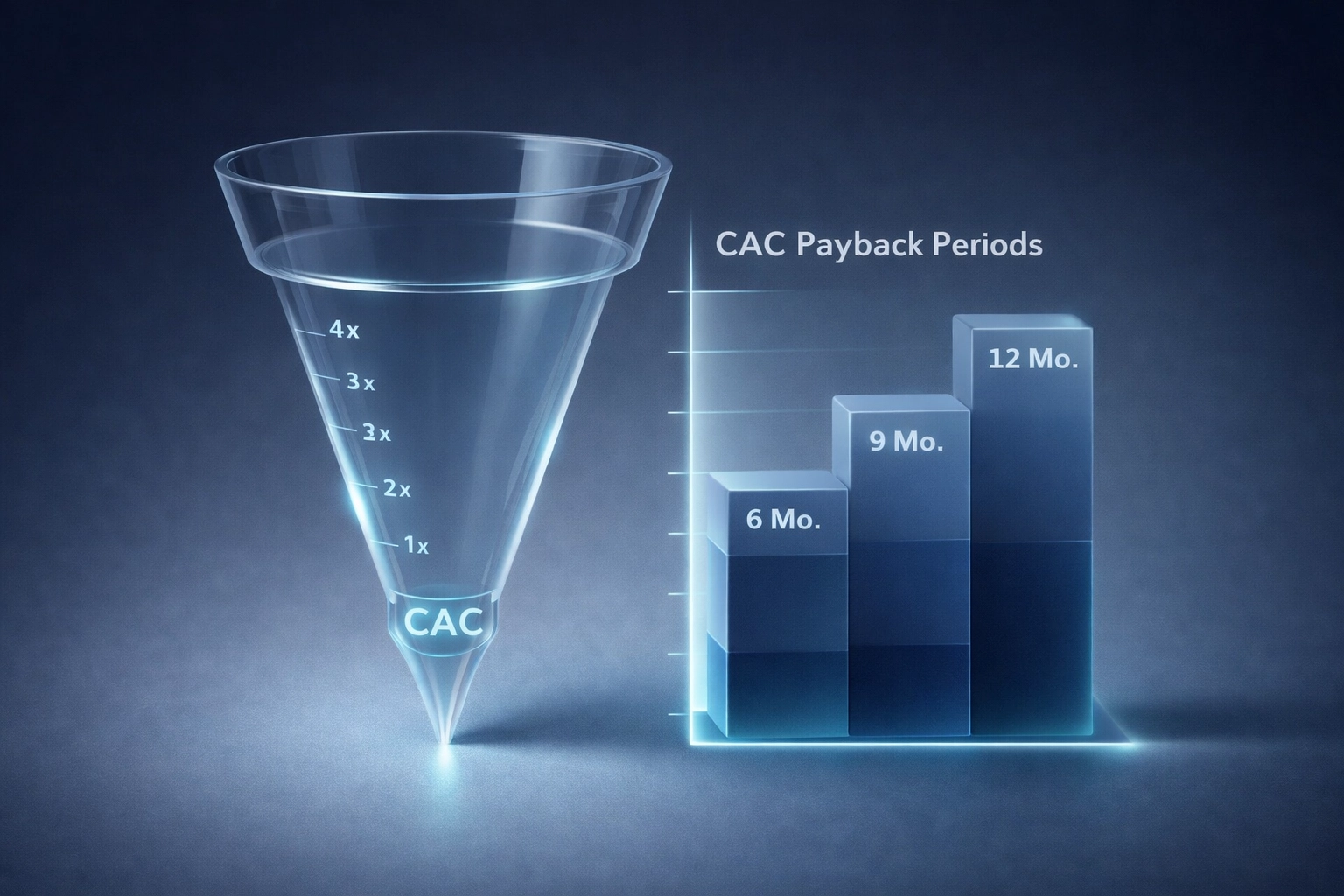
Visual: A futuristic 3D funnel graphic representing customer acquisition and lifetime value, with glowing data points flowing through a transparent structure.
5. Answer the "Investor Triad"
Every investor is internally asking three questions, regardless of what's on your slides. If your deck doesn't answer these with data, you're just making noise.
Why care? (Is the market big enough for a 100x return?)
Why believe? (Does the data prove this team can execute?)
Why now? (What has changed in technology or regulation that makes this possible today?)
The Hack: Structure your narrative around these answers. Use your startup valuation metrics to prove the "Why believe" section. If your valuation is based on multiples of similar companies, show the data. Transparency builds credibility.
6. Stop Being Vague About the "Ask"
The "Use of Funds" slide is often the weakest part of a deck. Founders usually put a pie chart that says: "60% Engineering, 20% Marketing, 20% Ops." This tells an investor absolutely nothing about what they are actually buying.
The Hack: Be radically transparent. Show exactly what milestones the new capital will unlock.
Category | Allocation | Expected Milestone |
Engineering | $1.2M | Launch Version 2.0 with AI-integration; reduce churn by 15% |
GTM / Sales | $800k | Hire 4 AEs; reach $3M ARR within 18 months |
Operations | $500k | Achieve SOC2 compliance; shorten enterprise sales cycle |
This level of detail shows you have an investor grade financial model behind the scenes. It proves you aren't just guessing: you’ve calculated your runway and your burn rate to the dollar.

Visual: A 3D node network or graph, representing interconnected business milestones and capital allocation, looking clean and high-tech.
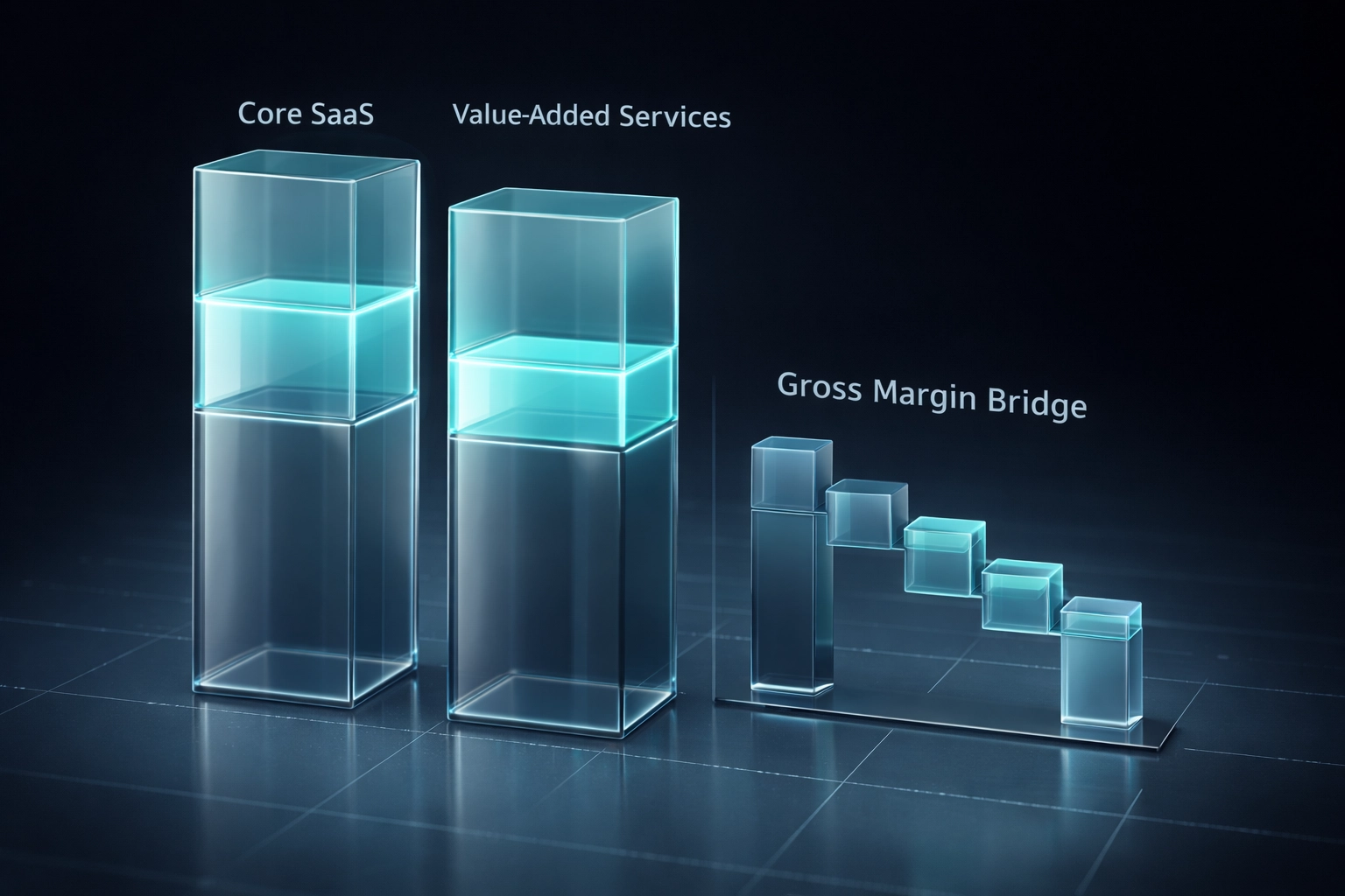
7. Strategic Simplification: The "4-Minute" Filter
You might have a complex, multi-layered revenue model. That's great for the due diligence phase, but it’s a killer for the initial pitch deck.
The Hack: Simplify the complexity without losing the depth. Use "T-shirt sizing" for complex data in the main deck, and keep the granular spreadsheets in your Appendix.
If you have five revenue streams, don't list them all in a dense table. Group them into "Core SaaS" and "Value-Added Services." Use a clean, 3D visualization to show the margin contribution of each.
Pro-Tip: If an investor has to squint to read a number on your slide, you’ve already lost their focus. Use large, bold fonts for your "Hero Metrics."
Why the "Pretty" Deck Usually Fails
We’ve seen beautiful decks: designed by high-end agencies: fail to raise a single dollar. Why? Because they lacked the "financial soul" that VCs crave.
Investors aren't looking for a designer; they’re looking for a partner who understands their unit economics. When you focus on data-driven hacks, you are signaling that you are a "Finance-First" founder. You are showing that you understand how to manage their capital effectively.
At CapMaven Advisors, we don’t just "fix" your slides. We dive into your financial modeling to find the story that the numbers are already trying to tell. That’s how we achieve a 70% conversion rate: by ensuring the data is so compelling that the graphics are just the icing on the cake.
Ready to Build a Deck That Actually Converts?
Don't waste another hour on Canva trying to find the right icon for "Scalability." Let's build a narrative rooted in data that makes VCs lean in.
Whether you need a full investor pitch deck service or a bulletproof financial model, we’re here to help you navigate the trenches of fundraising.
Ready to get started?Book an Online Meeting with our team and let’s turn your data into your greatest competitive advantage. Or, if you're just looking for more tips, check out our blog for the latest on SaaS metrics and fundraising strategies.
What’s the one metric in your deck you’re most worried about explaining? Let us know in the comments or reach out directly( we’ve probably seen it before.)
Comments